For me it’s working on the Ruby theme but only on desktop. Do you happen to know a way to make the dropdown visible in the mobile-view after gh-burger button is pressed?
For reference this is the site i’m working on
Thanks in advance!.
For me it’s working on the Ruby theme but only on desktop. Do you happen to know a way to make the dropdown visible in the mobile-view after gh-burger button is pressed?
For reference this is the site i’m working on
Thanks in advance!.
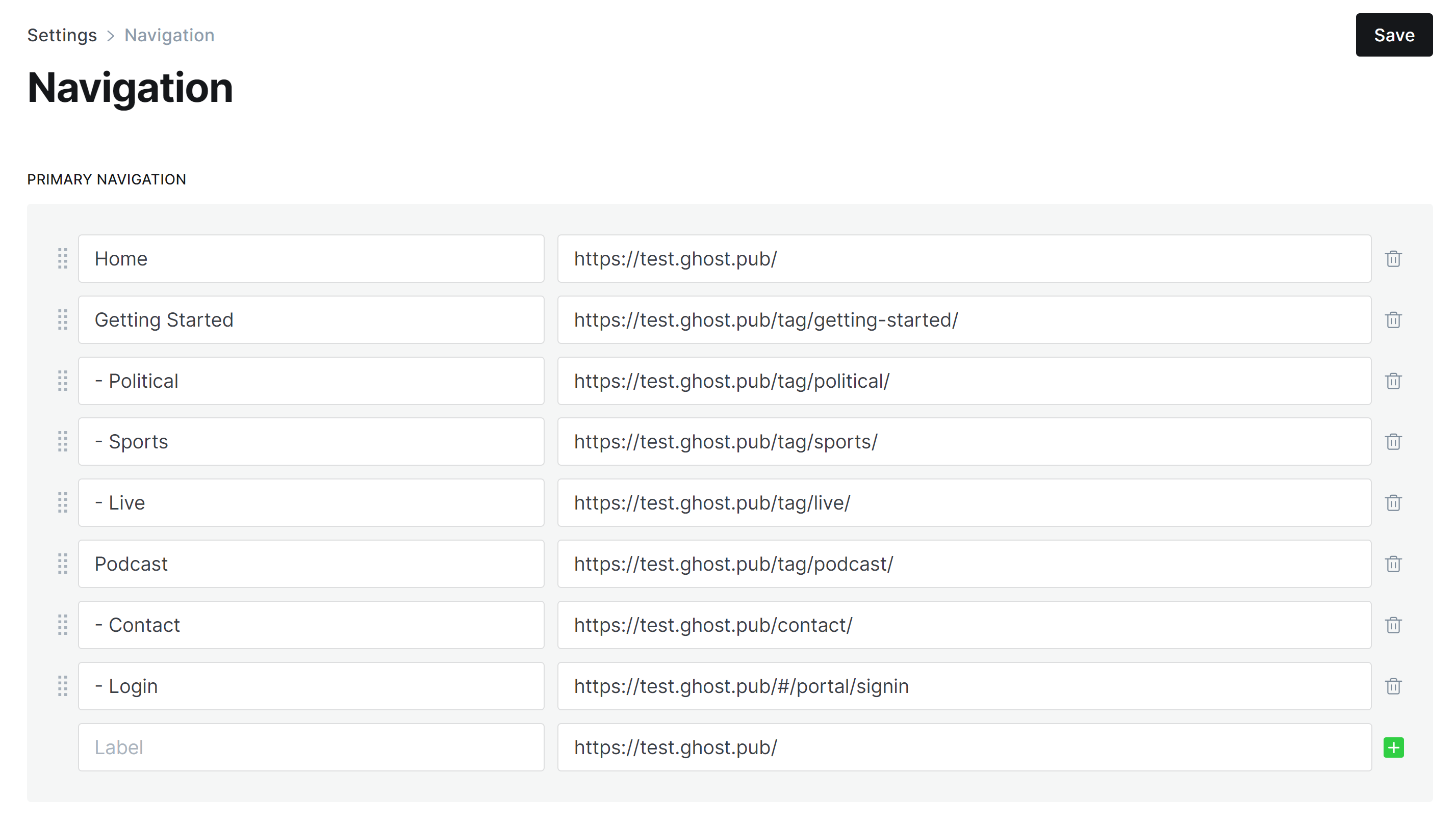
Hi, I’ve been reading your posts here on drop-down menus for casper theme. I tried them for my edition page, but it leaves the [has child] in the actual menu on the home page and creates … for the submenus. The theme I have his Edition. Any chance you can help? I’m not a coder and just trying to figure this out.
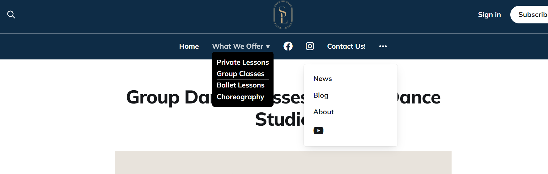
@johnnymac I have installed the Edition Theme on my test site, along with the Site Header and Footer Injection codes from this post, and it is working for me…
Here is a screenshot of my Site Navigation Menus that work with this:
You’re amazing! I think I just missed in this post that I need to use the dashes instead of the [subitem] as I was using from the earlier post. Thank you!
Hey! Thanks again for the help. I was adding a few more submenus today, and I seemed to have my limit with the fourth submenu. As a result, I had to move the “What We Offer” menu to left a bit, and push some of the “less important” items to the right as they are now forced beneath the dreaded “…”.
Was wondering if you’d seen this happen before? I think it has to do with the number navigation menus in Edition before it goes to the “…” on the right side of the navigation bar. Not sure if this can be avoided or not. Before, I when I only had two submenus in the picture shared above, it seemed to fit everything.
@johnnymac yes, the built-in dropdown in some of the default themes (including this one, it seems) tries to take over the ordering of menu items…
here are some other posts describing the problem…
You can also try different width settings in the media query
Thanks so much! I may just keep it as it is for now and have fewer nav menus at the top.
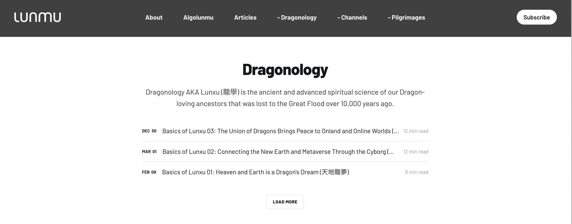
Does this menu drop-down system work on the new default Source theme?
Thank you for this. it is awasome. Works well in desktop. Is there any way to make it happen in mobiles too?
Could you please share the URL for the site so I can see what you are seeing?
@smartgoat – yes, thank you for the screenshots! Your displayed result is indeed the normal with this particular drop-down menu technique. An expanding/collapsing submenu in the mobile view would be preferred, but I haven’t had the free time to make it work.
The CSS to display the submenus indented underneath the menu item is, in my opinion, preferable to all of the menu items and submenu items being centered.
But, IMO it would be ideal if the submenu items were collapsible under the menu item in the mobile view as they are in the desktop view.
I might be able to do this, but I would need to be paid in order to, at the moment, take the time to code it.
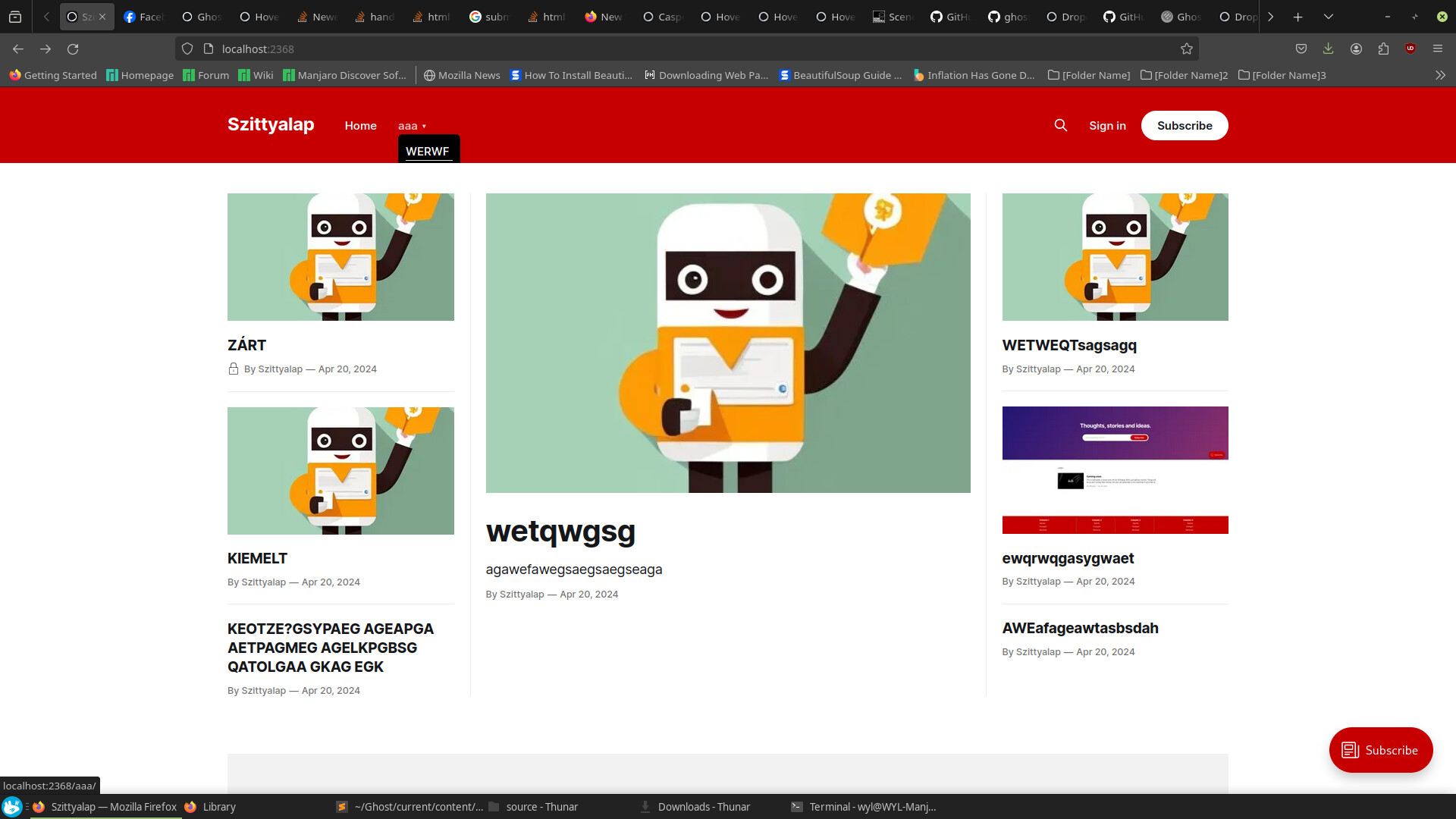
@denvergeeks your posts here has helped a lot - thank you. I have one issue with the code and that is if I change my display size to an ipad Air, I get the following view
@fretief what is the url of your posted image?
@denvergeeks not online unfortunately - running off a local instance for development at the moment
Hey!
I try to make this code work on my modified source theme, but the dropdown menu getting behind the page content. I modified the footer script like below. Any idea what get i wrong? Thanks!
<script>

(function () {
    const mediaQuery = window.matchMedia('(max-width: 991px)');

    // IMPORTANT: For themes other than Casper, change the selector just below to select your theme's header menu selector
    const menu = document.querySelector('.gh-navigation');
    const nav = menu.querySelector('.nav');
    if (!nav) return;

    // IMPORTANT: For themes other than Casper, change the selector just below to select your theme's header logo selector
    const logo = document.querySelector('.is-left-logo');
    const navHTML = nav.innerHTML;

    if (mediaQuery.matches) {
        const items = nav.querySelectorAll('li');
        items.forEach(function (item, index) {
            item.style.transitionDelay = 0.03 * (index + 1) + 's';
        });
    }

    const makeHoverdown = function () {
        if (mediaQuery.matches) return;

        var dropDown_list = [],
        latest_navigation_item,
        // IMPORTANT: For themes other than Casper, change the selector just below to select your theme's header menu item selector
        nav_list = document.querySelectorAll('.gh-navigation-menu li');
        var newMenuList = [];
        var menuTree = {};
So… Something was up with my files. I tried it on an original theme and its working. But my problem is, that its not showing dropdown on mobile, just on desktop page. Any idea what should i do to have the dropdown even on mobile?
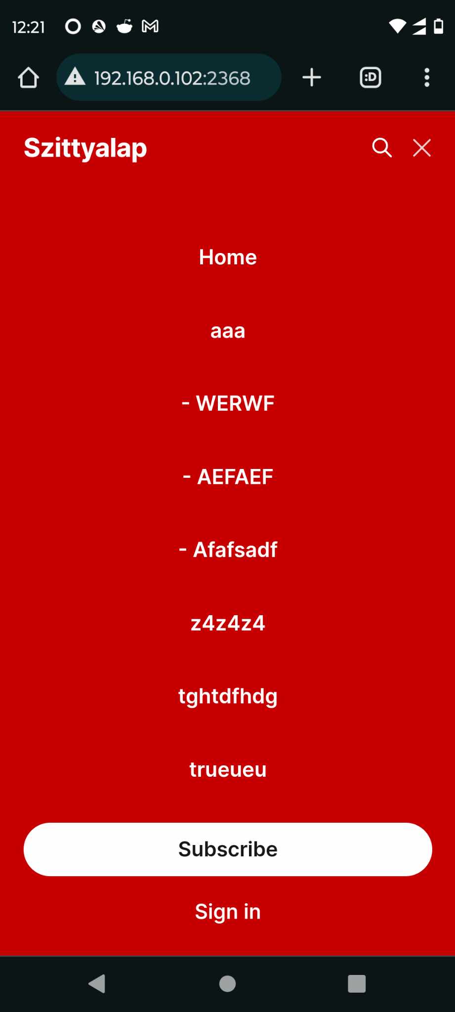
Hi, I am using edition theme and was finding that after I shrink my screen from larger than 991px to smaller than 991px, the menu is left in the expanded state with the hyphens. Is there any way to change this? I’m imagining its a small responsive CSS issue.
This is the website: https://www.lunmu.io/
And thank you so much for your great work on this!
This is the CSS:
/* DROP DOWN MENU */
@media (max-width: 991px) {
.has-cover.gh-head {
display: flex;
align-items: center;
flex-direction: column;
position: fixed;
top: 0;
bottom: 0;
right: 0;
left: 0;
z-index: 10;
width: 100%;
height: 100vh;
padding-top: 72px;
background-color: var(–background-secondary);
opacity: 0;
visibility: hidden;
transform: scale(0.96);
}
.has-cover.gh-head-open {
opacity: 1;
visibility: visible;
transform: scale(1);
transition: all half(var(–motion-duration)) cubic-bezier(0.694, 0, 0.335, 1);
}
}
@media (min-width: 991.1px) {
.has-cover.gh-head {
display: block;
flex: 2;
display: flex;
align-items: center;
justify-content: flex-end;
}
}
@media (max-width: 991px) {
.has-cover.gh-head-menu {
width: 100%;
padding-left: 32px;
padding-right: 32px;
}
}
@media (min-width: 991.1px) {
.has-cover.gh-head-menu {
display: flex;
align-items: center;
justify-content: flex-end;
}
}
@media (min-width: 991.1px) {
li[class*=“nav-”]:not(:last-child) {
margin-right: 24px;
}
}
@media (max-width: 991px) {
li[class*=“nav-”] {
margin-bottom: 16px;
}
}
@media (min-width: 991.1px) {
li[class*=“nav-”][class*=“–hasDropDown”] {
position: relative;
}
li[class*=“nav-”][class*=“–hasDropDown”] a:after {
all: unset;
content: “”;
padding-left: 5px;
font-size: 12px;
color: inherit;
}
li[class*=“nav-”][class*=“–hasDropDown”] .isDropDown a:after {
display:none;
}
li[class*=“nav-”][class*=“–hasDropDown”]:focus-within > li[class*=“nav-”]:after,
li[class*=“nav-”][class*=“–hasDropDown”]:hover > li[class*=“nav-”]:after {
background-color: transparent;
}
li[class*=“nav-”][class*=“–hasDropDown”]:focus-within .isDropDown,
li[class*=“nav-”][class*=“–hasDropDown”]:hover .isDropDown {
opacity: 1;
visibility: visible;
}
}
@media (min-width: 991.1px) {
.isDropDown {
z-index: 1;
opacity: 0;
visibility: hidden;
position: absolute;
margin: 0;
max-width: unset;
list-style: none;
/* The padding inside the drop down (the space surrounding the links) /
padding: 10px;
/ The rounded corners of the drop down /
border-radius: 6px;
/ The background color of the drop down /
background: #000;
/ The color of the links in the drop down /
color: inherit;
}
.isDropDown li[class=“nav-”] {
margin-right: 0 !important;
}
.isDropDown li[class*=“nav-”]:not(:last-child) {
margin-bottom: 0;
}
}
li[class*=“nav-”] a {
display: flex;
align-items: center;
width: -webkit-fit-content;
width: -moz-fit-content;
width: fit-content;
font-size: 16px;
line-height: 1.5;
font-weight: inherit;
}
@media (max-width: 991px) {
li[class*=“nav-”] a {
font-size: 1.7rem;
line-height: 1.5;
}
}
@media (min-width: 991.1px) {
li[class*=“nav-”] a {
position: relative;
}
li[class*=“nav-”] a:after {
content: “”;
display: block;
width: 100%;
height: 2px;
position: absolute;
bottom: -2px;
background-color: transparent;
}
}
/* Underline or other style for the link of the Current Page you are on /
li[class=“nav-”].nav-current a:after {
background-color: transparent;
}
/* Underline or other style for the Home link when you are on the Home page /
.home-template li[class=“nav-”].nav-current a:after {
background-color: transparent;
}
/* Underline or other style for the links in certain states /
li[class=“nav-”] a:active:after,
li[class*=“nav-”] a:focus:after,
li[class*=“nav-”] a:hover:after {
background-color: transparent;
}
@media (max-width: 991px) {
#gh-head .gh-head-inner {
grid-template-columns: 1fr;
height: auto;
}
.gh-head-open #gh-head .gh-head-menu,
#gh-head .gh-head-menu .nav {
align-items: flex-start;
display: flex;
flex-direction: column;
margin: 0 auto;
}
.gh-head-menu .nav li {
text-align: left;
}
.gh-head-menu .nav li.hasDropDown {
margin: 0;
padding: 0;
display: flex;
flex-direction: column;
align-items: flex-start;
}
.gh-head-menu ul.isDropDown {
list-style: none;
text-align: left;
margin: 0;
padding: 0 0 0 10px;
}
.gh-head-menu ul.isDropDown li {
margin: 0;
padding: 0;
text-align: left;
}
.gh-head-menu ul.isDropDown li a:before {
all: unset;
content: " - ";
}
.gh-head-menu ul.isDropDown li a {
font-size: 2rem;
line-height: 1.5;
}
}
@denvergeeks actually I solved this issue but now get the dreaded “…” in my edition theme. Is there any way to disable this feature?