You are a genius @denvergeeks
It works! 
@Joan, we did it together – kudos to us both! It was a fun learning adventure, no?
Where else can a person receive such a kind compliment for simply standing on the shoulders of giants? (The giants here are the core developers and other contributors here who provided the building blocks we used.) Open-source ROCKS!!!
2 Likes
First of all, Merry Christmas! 
I found a “bug” with your code.
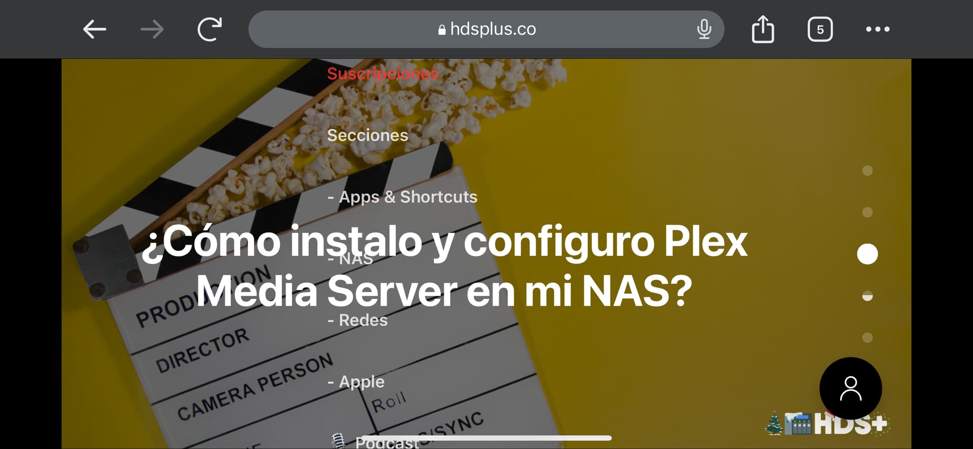
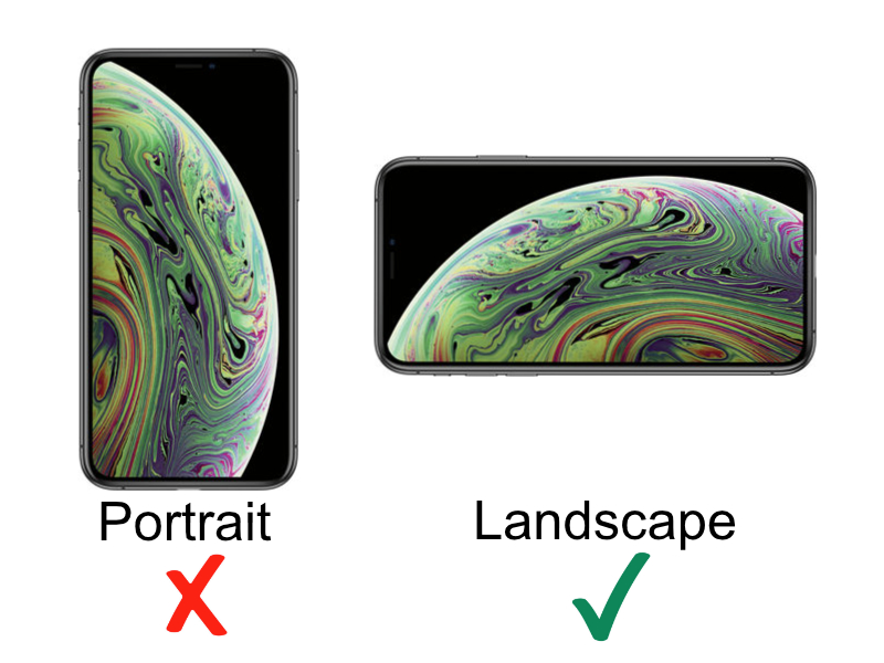
If you put the iPhone in landscape mode, the menu looks terrible. Without style.

I think more resolutions should be added to this part of the code.
/* OPTIONAL: in mobile, left align all menu items and indent submenu items */
@media (max-width: 991px) {
Thanks for all @denvergeeks
@Joan I cannot reproduce what you are seeing – here is how I see your site on my iPhone 13 Pro…


What do you want it to look like?
Try Changing the iPhone to landscape mode with the “megamenu” closed
This one is a snapped screenshot directly on my iPhone…

This one is using the same tool as my pics above…

I’m not sure if it might be related, but your home page is crazy-slow loading…
It’s strange…
All of Your actual Code injection is like this, right?
https://forum.ghost.org/t/hover-down-submenus-for-casper-here/34010/22
I will look the page speed, but on my iPhone 14 Pro Max with landscape mode only, the menu looks wrong As I have shown you in the previous pictures. I will continue testing…
Yes @Joan – I just now freshly copied/pasted in that very code you linked to above and added the navigation menu items into my cleanly-installed Casper testing site at https://casper.ghost.pub…
Here are current screenshots of the…
Site Code Injections…

Navigation Items…

@Joan did this code work out for your purposes?
Hi @denvergeeks
As I told you earlier, in panorama view on the iPhone 14 Pro Max, the menu looks bad. I have tried to install another instance of Ghost with the default Casper Theme and also is wrong on my case…
I still cannot reproduce your problem except for on your own site.
On all of my devices and browsers this menu code works on my clean Version: 5.34.0 with Casper test site:
Please check on all your devices this clean install using the Casper theme. Other than the CSS and JS in the site’s header and footer code injection as instructed in this post, there are no modifications to the theme.
Please take your screenshots on that site if you find any issues.
1 Like
On your site looks good!
I tried now another clean instance with the latest Ghost version and Casper Theme by default (without any modifications).
Could you check in detail the code used in your test web if there is something different?
I don’t understand…
In one of the videos, I show the Code Injection. You will see that there is only your code.
Look the video i maked with my iPhone and Mac:
Hey denvergeeks, first just want to say thanks so much for this piece of code.
I’m having an issue with my dropdown which pops up when using a tablet to browse the site. Essentially the dropdown menu isn’t playing nice with Casper’s built in dropdown menu. Some of the child menus will end up being put into Casper’s menu.
For example, let’s say there is a parent element with child A, B, and C. Depending on where the menu is put, child B and C will be placed under the Casper menu, and only A will appear as a submenu under the parent.
Another issue is that the submenu doesn’t appear to work under some window widths. Here is a screenshot of the demo site you linked to demonstrate it:

Here’s a screenshot of the issue in that first problem I mentioned with child elements being tucked under Casper’s default dropdown menu:

I’m having the same issue at https://www.scenepensacola.com, using the Solo theme.
I did not alter any of the code, just copied the header/footer code into site injection, and added hyphens to the links i wanted under the Reviews dropdown.
@scenepensacola I don’t know which issue you are referring to – your screenshot looks fine. Please add more detail and a screenshot showing the problem…
Also, I have temporarily installed the Solo theme at https://casper.ghost.pub for testing. I found I had to use
color: #ffffff;
instead of
color: inherit;
under the CSS selector .isDropDown in order to make the text links in the dropdowns white on pages other than the front page.
Other than that, the dropdown seems to be working fine on that fresh testing site…
Hey Denver, the issue I’m having is the other navmenu links are relegating to Solo’s default dropdown menu, leaving a bunch of empty space. I’ll attach a pic of what it looked like before with all the navmenu items showing.

Not sure why when I use the code and have a dropdown menu, the nabber no longer stretches the with of the screen.
OK @scenepensacola I have installed a fresh new temporary site with the Solo theme for testing at
However I cannot seem to reproduce the problem you are having.
I could take a peek at your site, but you would need to enable the header/footer dropdown code.
@scenepensacola I can now reproduce your issue. But I think you would have to either disable the SOLO THEME’s default/built in dropdown, or, modify the code for that dropdown.
I did, however, make a version of the code that plays nicer with the SOLO THEME (click just below):
Click Here to Get the Alternative Code Version Modified for the SOLO THEME
FOR SOLO THEME
Site HEADER Code Injection:
<style>

li[class*="nav-"][class*="--hasDropDown"] {
	position: relative;
}
li[class*="nav-"][class*="--hasDropDown"] a:after {
	content: "▼";
	padding-left: 5px;
	font-size: 12px;
	color: inherit;
}
li[class*="nav-"][class*="--hasDropDown"] .isDropDown a:after {
	display:none;
}
li[class*="nav-"][class*="--hasDropDown"]:focus-within > li[class*="nav-"]:after,
li[class*="nav-"][class*="--hasDropDown"]:hover > li[class*="nav-"]:after {
	background-color: transparent;
}
li[class*="nav-"][class*="--hasDropDown"]:focus-within .isDropDown,
li[class*="nav-"][class*="--hasDropDown"]:hover .isDropDown {
	opacity: 1;
	visibility: visible;
}
.isDropDown {
	z-index: 1;
	opacity: 0;
	visibility: hidden;
	position: absolute;
	margin: 0;
	max-width: unset;
	list-style: none;
	/* The padding inside the drop down (the space surrounding the links) */
	padding: 10px;
	/* The rounded corners of the drop down */
	border-radius: 6px;
	/* The background color of the drop down */
	background: #000;
	/* The color of the links in the drop down */
	color: #fff;
}
.isDropDown li[class*="nav-"] {
	margin-right: 0 !important;
}
.isDropDown li[class*="nav-"]:not(:last-child) {
	margin-bottom: 0;
    /* Dividers between the dropdown items */
    border-bottom: 1px solid #ddd;
}
</style>
Site FOOTER Code Injection:
<script>

(function () {
    const mediaQuery = window.matchMedia('(max-width: 767px)');

    // IMPORTANT: For themes other than Casper, change the selector just below to select your theme's header menu selector
    const menu = document.querySelector('.gh-head-menu');
    const nav = menu.querySelector('.nav');
    if (!nav) return;

    // IMPORTANT: For themes other than Casper, change the selector just below to select your theme's header logo selector
    const logo = document.querySelector('.gh-head-logo');
    const navHTML = nav.innerHTML;

    if (mediaQuery.matches) {
        const items = nav.querySelectorAll('li');
        items.forEach(function (item, index) {
            item.style.transitionDelay = 0.03 * (index + 1) + 's';
        });
    }

    const makeHoverdown = function () {
        if (mediaQuery.matches) return;

        var dropDown_list = [],
        latest_navigation_item,
        // IMPORTANT: For themes other than Casper, change the selector just below to select your theme's header menu item selector
        nav_list = document.querySelectorAll('.gh-head-menu li');
        var newMenuList = [];
        var menuTree = {};

        nav_list.forEach( (item, index) => {
            if(item.childNodes[0].innerText.startsWith('-')) {
                if(menuTree[newMenuList.length - 1]) {
            menuTree[newMenuList.length - 1].push(item);
                } else {
            menuTree[newMenuList.length - 1] = [item];
            }
        } else {
        newMenuList.push(item);
        }
        });

        nav_list = newMenuList.map((item, index) => {
        if(menuTree[index]) {
            let dropdown = document.createElement('ul');
            dropdown.className = 'isDropDown';
            menuTree[index].forEach(child => {
                dropDown_item_text = child.childNodes[0].innerText;
                child.childNodes[0].innerText = dropDown_item_text.replace('- ', '');
                dropdown.appendChild(child);
            });
        item.className += '--hasDropDown';
        item.appendChild(dropdown);
        }
        return item;
        });
    }

    imagesLoaded(logo, function () {
        makeHoverdown();
    });

    window.addEventListener('resize', function () {
        setTimeout(function () {
            nav.innerHTML = navHTML;
            makeHoverdown();
        }, 1);
    });

})();
</script>
1 Like
Thank you! I’m going to give your code a try tonight. I’m not aware of the Solo them having default dropdown code. Is there actually one built in that you know of?
One other thing I noticed on your demo SOLO site, is that the default burger menu when the screen width is less than the navbar, has a purplish background. On my site, it’s a gray background for the homepage, and a black background for all sub-pages. Would love to make the one on the homepage also black. Is there an easy way to do that?
Thanks again, super appreciate you taking the time to help me with this!

