Ahoy folks,
I’m using Ghost Pro, with the Braun theme installed. I’ve tried contacting the Braun dev for support but it’s been a few days now, so I thought I’d try here.
I’ve been trying to have my logo appear like that on https://virtualgarden.greenspell.org/, which also uses Braun.
The default is for the logo to be in a small circular wrapper to the left of the site title and tagline, as you can see right now on my site rightoturbo.com.
I’m not a dev, so I’ve been working with Gemini to get there – and frankly we get most of the way: it all works fine on desktop view, but the mobile view sees the logo get cropped.
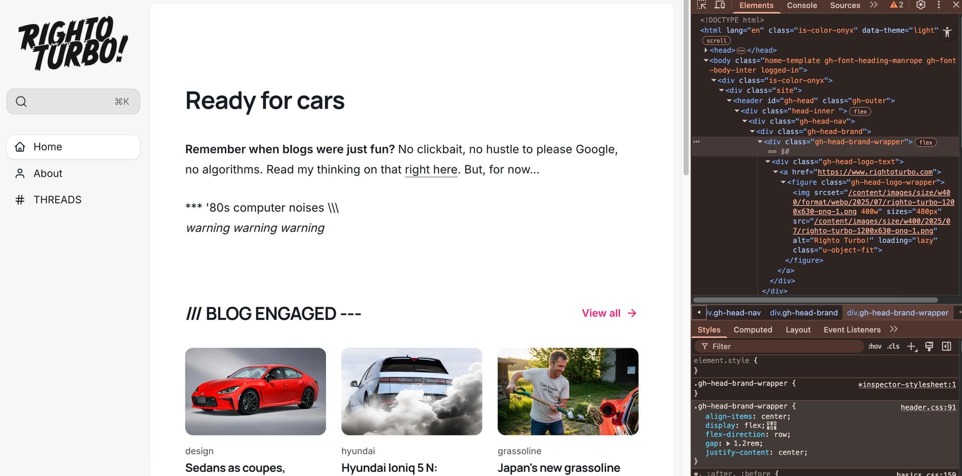
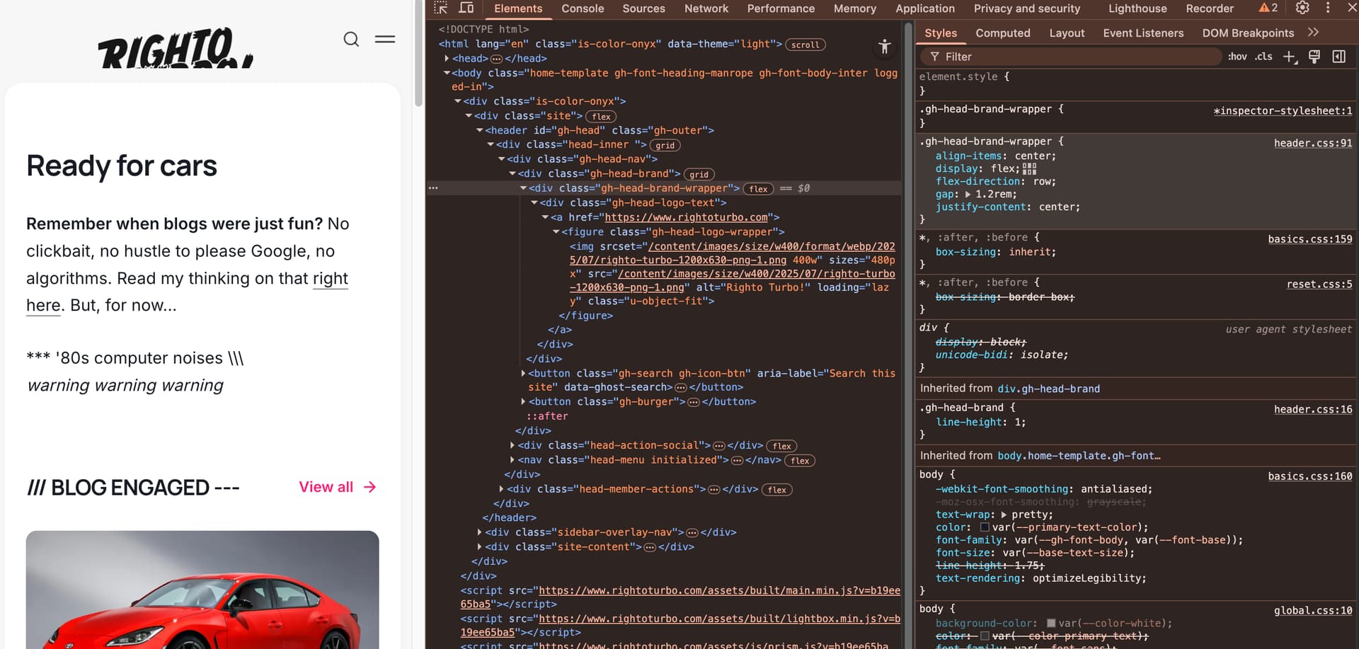
So, for now, I’ve reverted back to the default, using an icon/monogram version of my logo.
Here some points Gemini told me to include in my call for help!
- Setting a
heighton.gh-head-logo-wrapperjust squashes the theme’s circular mask. - Changing the wrapper to a rectangle and setting a smaller
heightstill results in the image being cropped. - Changing the
heightof parent containers like#gh-headtoautobreaks the entire page layout. - Setting a
heighton the.gh-head-brand-wrapper(as seen in one of your demos) also does not fix the cropping.
To be clear, I’m perfectly happy to pay a dev to resolve this, if any would like to get in touch.
Many thanks!