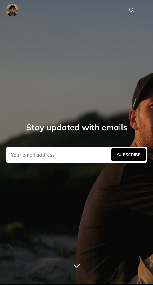
My homepage cover image looks great on desktop but not on mobile.

How do I make the image crop or align differently on mobile? I think it would be enough if the image would center on mobile or resize.
Assuming you are using the Edition theme, you can try adding the following in Code injection:
<style>
@media only screen and (max-width: 600px) {
  .cover-image { object-position: left; }
}
</style>
You are not in the center of the image and without a link to see it live, it’s hard to suggest meaningful values for the object-position property. You can play around with the object-position attribute to find a suitable value:
Thanks for the link. I played around with a bit and was able to move the head into the viewport but I can’t seem to move the image higher up… https://ghost8943234.pikapod.net/
I tried:
<style>
@media only screen and (max-width: 600px) {
  .cover-image { object-position: 25% -20%; }
}
</style>
Then I tried
<style>
@media only screen and (max-width: 600px) {
  .cover-image { object-position: 25% -100px; }
}
</style>
But then it moves the image up and below there is a gray box :(