Newsletter source theme makes reading difficult. See more: Crafting Digital Experiences That Wow Through Technology
Here are best practices: Material Design
With the link you shared, I see this:
The contrast level far surpasses the WCAG guidelines.
Are you seeing something different?
Yes, because of the high contrast value, I think it is much more difficult to read. I tried to fix this on my own website, but I’m not a designer and I don’t know the best practices on this subject. Just from a user’s point of view, there is a UI that tires the eye.
Gotcha. I missed what you were after.
You can try adding this snippet to Code Injection → Site Header:
<style>
  :root {
    --background-color: #141218;
    --color-primary-text: #E6E0E9;
  }
</style>
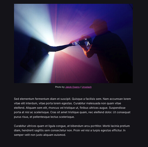
I took these colors from Google Material 3 guidelines. It renders like this:
Thank you for the information. Will you apply it to the theme itself? Because it is much better in terms of readability than the current colors. See: Every Programmer Should Know #2: Optimistic Concurrency Control


