Hello all, I created a table via the HTML Cards with the following code:
<table class="table-comparison tbody-bg-odd">
  <thead>
    <tr>
      <th></th>
      <th>Basic</th>
      <th>Standard</th>
    </tr>
  </thead>
  <tbody>
    <tr>
      <td>All limited links</td>
      <td>❌</td>
      <td>✅</td>
    </tr>
    <tr>
      <td>Own analytics platform</td>
      <td>❌</td>
      <td>✅</td>
    </tr>
    <tr>
      <td>Chat support</td>
      <td>❌</td>
      <td>✅</td>
    </tr>
    <tr>
      <td>Optimize hashtags</td>
      <td>❌</td>
      <td>✅</td>
    </tr>
    <tr>
      <td>Unlimited</td>
      <td>❌</td>
      <td>✅</td>
    </tr>
    </tr>
  </tbody>
</table>
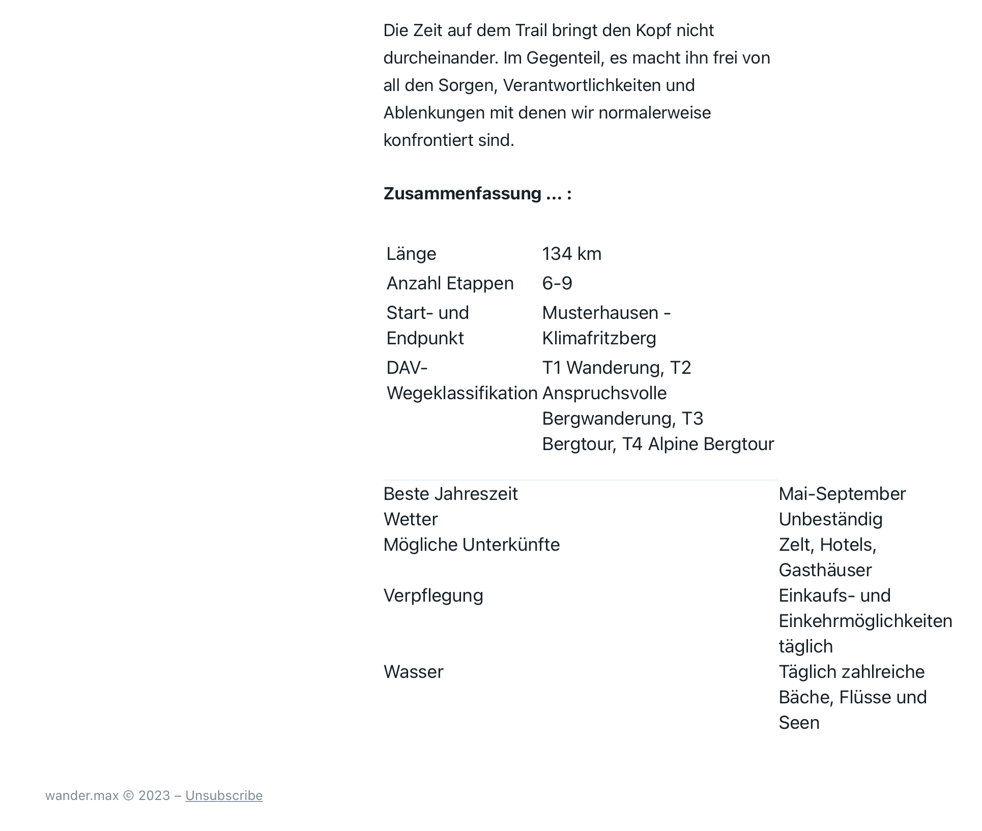
It worked fine till ich checked the previews. In mobile and desktop it looked good. But in the newsletter preview the whole layout is destroyed. The second picture is the broken newsletter, first is without html card table.

how do I fix that? Please help 