I’m seeing a strange issue with the Lyra theme in which a full-width post on the home page is displaying the wrong image size (thumbnail) and scaling it up to fit. The affected image is the oldest post, at the bottom of the page.
I haven’t edited the theme itself, and removing my custom CSS doesn’t fix the problem. It had been displaying normally, until I added a new post this morning. And, weirdly, if I disable Javascript this post disappears entirely. (EDIT: The second-oldest post disappears with it.)
The blog isn’t live, so I can’t link to it, but here’s a screenshot:
It’s either that the image is too narrow / small, or there’s some CSS stretching it… or both. Are you able to link to the page showing this issue? We’ll be able to debug it much better then
I can, and I may later (currently trying to migrate a large number of posts over from another platform, so it’s not a priority). It is a little blurry on the post’s page, but not terribly so.
That’s not actually the issue on the home page, though. The scaling is much worse because it’s using not the 800px size but a 300px thumbnail version of the picture. Any idea why it would be doing this?
Thanks for that, it really helped me to debug the issue.
Seems to be an inconsistency between Safari and every other browser. Safari is stretching the image rather than “covering” the space. Chrome and Firefox appear fine though. I wonder if this is an edge case with smaller images?
If you set it to draft and let a different post appear last does that image also stretch? The themes design makes the last image stretch on purpose to give more variety in layout
Ah, you might need to replace the image instead. The layout changes depending on the amount of posts. Best to use a larger image as a test, something similar in size to the ones shown on demo.ghost.io
One note, though, just so we’re seeing the same thing: if you right-click to open that image in its own tab in Safari, you can see it’s using the 300px size. So there’s still something weird here, since it’s not using the full-size image in the first place.
This is down to responsive images and srcset. The browser is deciding which image is most suitable to show in the space, and since Safari thinks the space is quite small it’s showing a smaller version of your image. Ghost creates multiple sizes of the feature image when you upload it so srcset can use them and help with browser performance
Changed out the image with a larger one, but it’s still using a 300px scaled image on the home page. Unless there’s a workaround, I guess we just hope for a future Safari srcset fix?
Anyway, thanks for trying to work through this with me!
On further research, it looks like Safari is defaulting to the first srcset size in the list, which happens to be 300px here. What’s recommended for browsers where srcset isn’t supported is leading with the preferred default size, since it will default to that.
So maybe a good interim solution would be just reordering the sizes to start with 1000px instead of 300px? Any browser that supports srcset would still choose the correct one, and the rest wouldn’t need to scale.
I think you’re following the right route here, but sadly srcsetshould work in Safari. Have you done any more comparison tests with different image sizes? Quickly checking the Casper demo in Safari it’s dealing with images ok there, see the screenshot below:
I’ve tested it now with a 2000px-wide version of the image, and it made no difference: still scaling from 300px.
But I think I’ve tracked down the origin, and it’s a super weird one: post count. I did some testing, and the issue begins once my post count passes 15. At the 16th post, the oldest/bottom post starts showing the issue. At the 17th, the two oldest posts show it, and so on.
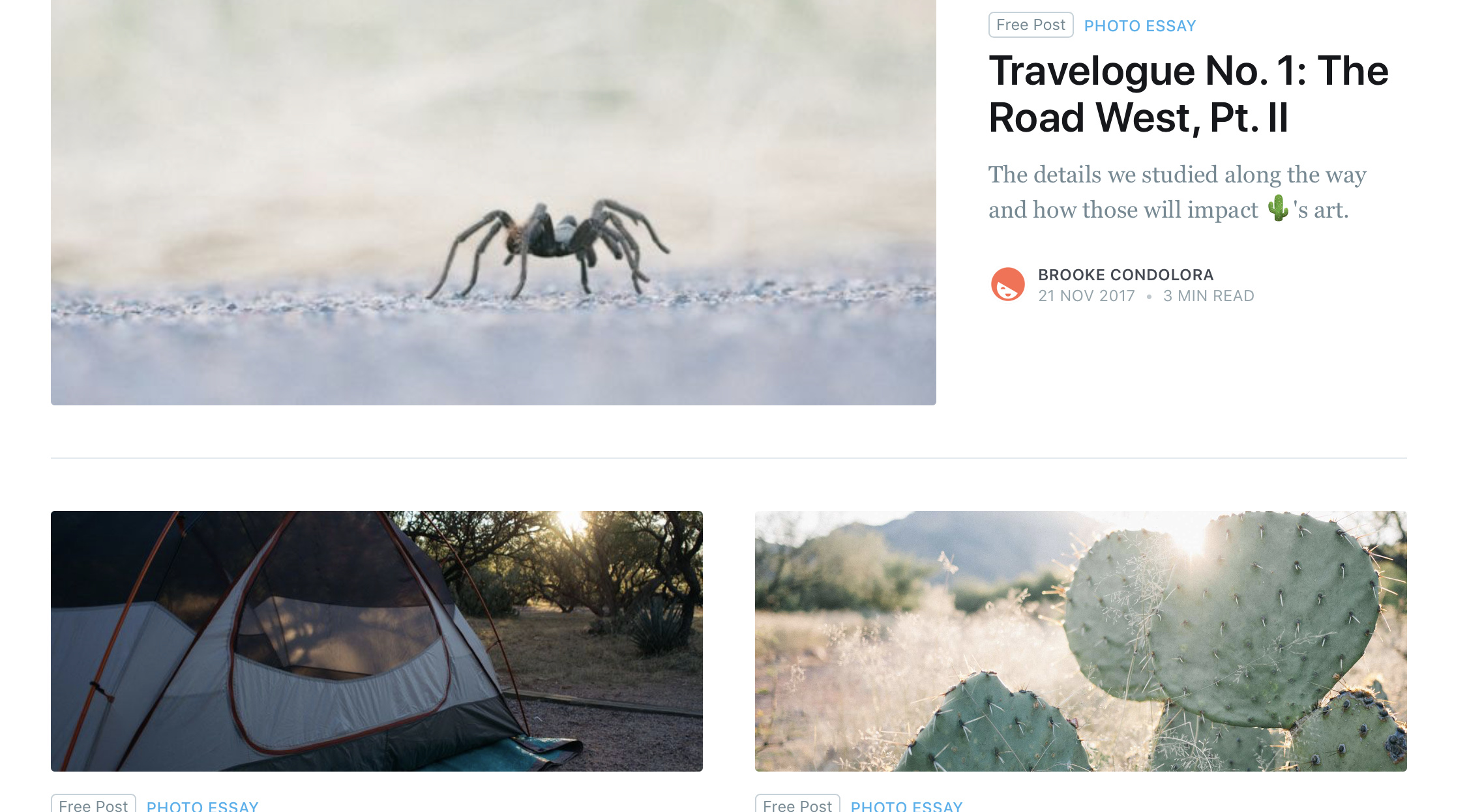
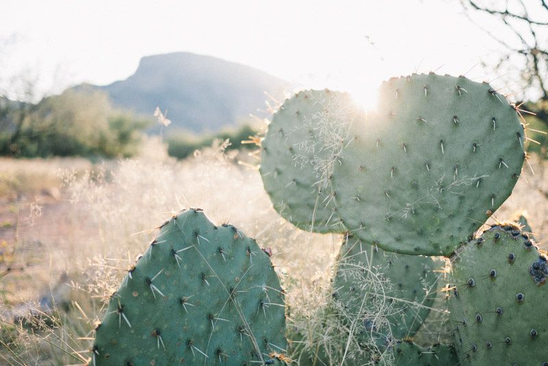
I even dropped it back down to 15 posts to confirm that there was no scaling at that count. Look at that beautifully normal cactus:
I tested it up to 18 posts, which gave me three scaled posts at bottom. (That’s the current state, if you want to take a look.) This is what made it most obvious to me, as the other posts next to the third oldest look normal. Interestingly, it’s always the affected posts only that disappear when Javascript is disabled.
I’m guessing you could even reproduce this with the demo if you added enough posts. I’m not sure what any of it means, though. Any ideas?
Did you try an image that is both wider and taller? It only seems to affect a couple of your posts, most of them scale fine. Maybe set this issue aside and monitor it? Wouldn’t want an issue like this to hamper your progress
@DavidDarnes It’s not related to the dimensions of my image. It continues affecting more posts as I add new ones, like I explained above.
@Kevin Ah, that must be it! I’ll just wait for that fix to be ported, then, since mine’s not live yet anyway. Unless there’s a way for me to make the change on my end?


 , are you not able to provide a larger image? 800px even on a mobile screen will appear blurry
