Hi folks,
Can I use the {{feature_image}} helper to insert a background image into a section?
I’m customising the Weiss Pro theme in a localhost env, and have used existing styles to bring the newsletter signup section to a position between feature posts and the post_card loop. I have then populated this section with content from a Page. All of this is working successfully, but I’d like now to use the feature image as the section background image rather than inline on the page.
This is the code, where I’ve tried to use the helper…
{{!-- Homepage welcome page --}}
      <section class="m-newsletter-section" style="border: 1px solid #f00; background-image: url('{{feature_image}}'');">
        <div class="l-wrapper">
          {{#get "pages" slug="home" as |post|}}
            {{#post}}
              {{> "custom-welcome"}}
            {{/post}}
          {{/get}}
        </div>
      </section>
{{!-- end welcome --}}
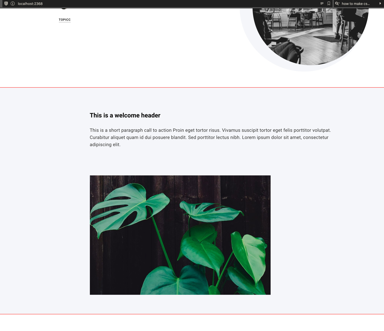
Here’s a screenshot of what I’m seeing, the plant photo being the feature image I’m trying to use as a background:
partials/custom-welcome.hbs is just a copy of partials/post-card.hbs taken from the CASPER theme, with author, tags etc removed. The responsive feature image code is still there, for now.
<article class="post-card {{post_class}} {{#unless feature_image}}no-image{{else}}{{#is "home"}}{{#has index="nth:6"}}post-card-large{{/has}}{{/is}}{{/unless}}">

<div class="post-card-content_banner">

        <header class="post-card-header">
            <h2 class="post-card-title">{{title}}</h2>
        </header>

        <section class="m-article-content js-post-content">
                <p>{{content}}</p>
        </section>

{{!--/.post-card-content--}}

{{#if feature_image}}
    {{!-- This is a responsive image, it loads different sizes depending on device
    https://medium.freecodecamp.org/a-guide-to-responsive-images-with-ready-to-use-templates-c400bd65c433 --}}
    <img class="post-card-image"
        srcset="{{img_url feature_image size="s"}} 300w,
                {{img_url feature_image size="m"}} 600w,
                {{img_url feature_image size="l"}} 1000w,
                {{img_url feature_image size="xl"}} 2000w"
        sizes="(max-width: 1000px) 400px, 700px"
        src="{{img_url feature_image size="m"}}"
        alt="{{title}}"
    />
{{/if}}
I think what I’m trying to achieve is doable, based on what I’ve seen on other themes and the documentation, but I’m not sure if I’m doing this the right way, or even in the right place.
Hopefully someone could steer me in the right direction!
When I get the background working, I’ll be endeavouring to maintain the section on a specific height and let the background be responsive as well as styling the text. I’m trying to achieve a look familiar to anyone who has played with Squarespace sites, i.e. the Rally demo, but without parallax scrolling, and use this as a welcome / call to action page that I can easily edit in the Ghost Admin area.
Thanks in advance!

