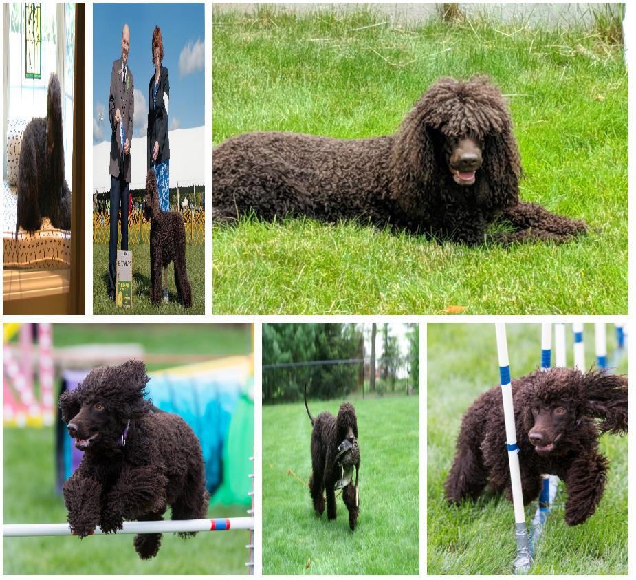
I am using the Editorial theme and I’m having a problem with the display of the photo gallery using 9 photos. It looks good in the set up but when viewed through the web browser (Chrome) a couple of pictures on each row gets compressed. Any thoughts on how to fix it so all the pictures show correctly?
Could you provide more information please? Like the version of the theme you’re using and the version of Ghost?
I am using the latest version of Ghost (3.12.1) and the theme (Editorial) version is 2.0
When I switched to the default theme (Casper 3.0.11) the pictures in the gallery all look fine
Thanks for the information, would you be able to provide an example on your site? It’ll help us to debug the problem 
The problem is that the Casper theme correctly uses flex in the image size CSS, while Editorial uses fixed height and width values.
I posted a screenshot in the original post. The site is not currently live to the outside world, so I can’t give you a working URL. I could capture the HTML that is output.
You seem pretty comfortable with CSS, would you be willing to submit a fix to the theme itself? ![]()
Hi, I can identify the difference but don’t know where or how to execute a fix.
That’s ok, are you able to fix the CSS on your own site and share the code here?
I have the same problem with the theme.
