With autumn in full swing, we've just finished doing some spring cleaning. Ghost Admin's settings area has had an overhaul and a refresh.
Many new features have been added to Ghost in the past couple of years and, as we introduced new concepts, it became difficult to organise their settings. Multiple workflows required clicking in and out of multiple different screens, just to get one thing done.
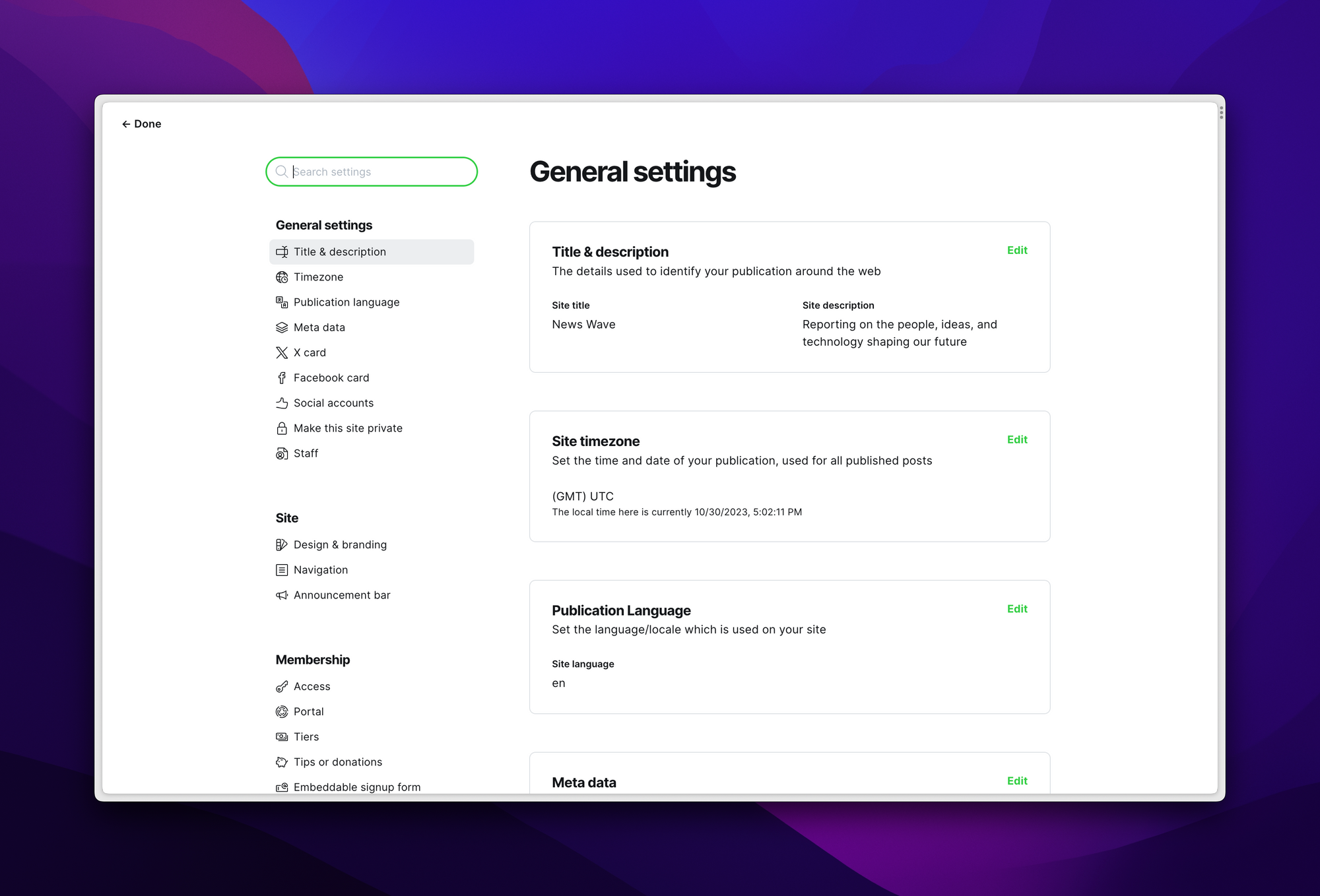
Now, we've unified Ghost settings in a single screen with dedicated navigation and search. It's simpler to browse all settings by scrolling to discover them, and it's faster to find a specific setting by searching to find it.
We do know moving settings around can be disruptive to existing workflows, so thanks for your patience with re-training some muscle memory.
Ghost(Pro) users can log in and start enjoying all of this right away! If you're a developer, self-hosting Ghost, you'll need to update to the latest version to get access to everything that's new.
Yeah, I haven’t been a fan of this. I understand the principle, but the second level of side-navigation blocking out the first level is jarring, and the new sidebar is just so dense and annoying…
Ah, the Principal Skinner, Star Wars, and WordPress approach. “No, it’s the users who are wrong.” Could you at least address the bugs and constant backend errors that started when this launched?
take it back, the boxes are better than just putting it somewhere. but the nav on the left is so tiny - would love if it was color coded or had some better distinction please.
I mean, yeah it’s nice. But have you tried using it on mobile? But also on desktop it doesn’t make any sense. To download the redirects.yaml for example, I need 1 click more compared to the old one.