
Hi @akimo,
Are those multiple image galleries or just one?
It seems to be the margin setting of the elements, technically you could overwrite it from code injection.
Can you share a link to your post?

Hi I run it locally.
This is the first time to install a help article that ghost exists by default.
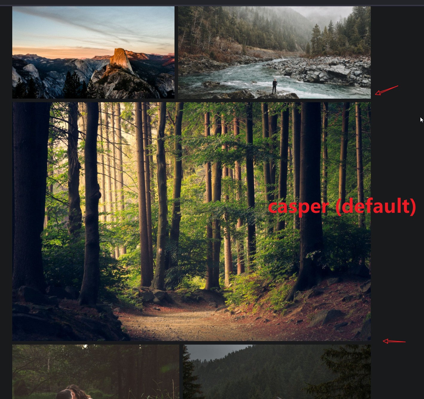
I use the default theme and everything looks good.
Switch to dawn, and it doesn’t look right. It becomes wider.
I’m not sure if this is a problem. I just want to report what I see.
Because this part is not very beautiful.
In addition, the forest image in the middle is not a picture library. The images above and below are the image library.
I think as long as we test it, we can find the existence of this problem.
Well, you could inspect the elements to see where the spacing is coming from, on the demo page of the dawn theme I can’t see this issue.


I downloaded and installed dawn again. The problem remains.
My dawn and ghost are up-to-date and have not modified any files or contents.
After the following tests, it still exists.
I think the problem itself may be caused by my misoperation. Thank you.
That is actually normal behavior, spacing between gallery and image or gallery and gallery is set in the theme:

Of course, you can overwrite that in code injection, or maybe add all images in the same gallery to have the same spacing between those.
Try this code injection:
<style>.u-text-format>.kg-card+ .kg-card { margin-top: 1rem; }</style>
1 Like


